Perceived color quality
Baseline
Frequently reported as dull or washed
Redesign
Brighter and closer to intended wallpaper tone (qualitative uplift)
For Samsung Z4, I reframed user complaints about dull personalization as a system behavior problem. The work aligned research, visual design, engineering, PM, and marketing around a shipped changeable UI algorithm update for TFT-constrained devices.
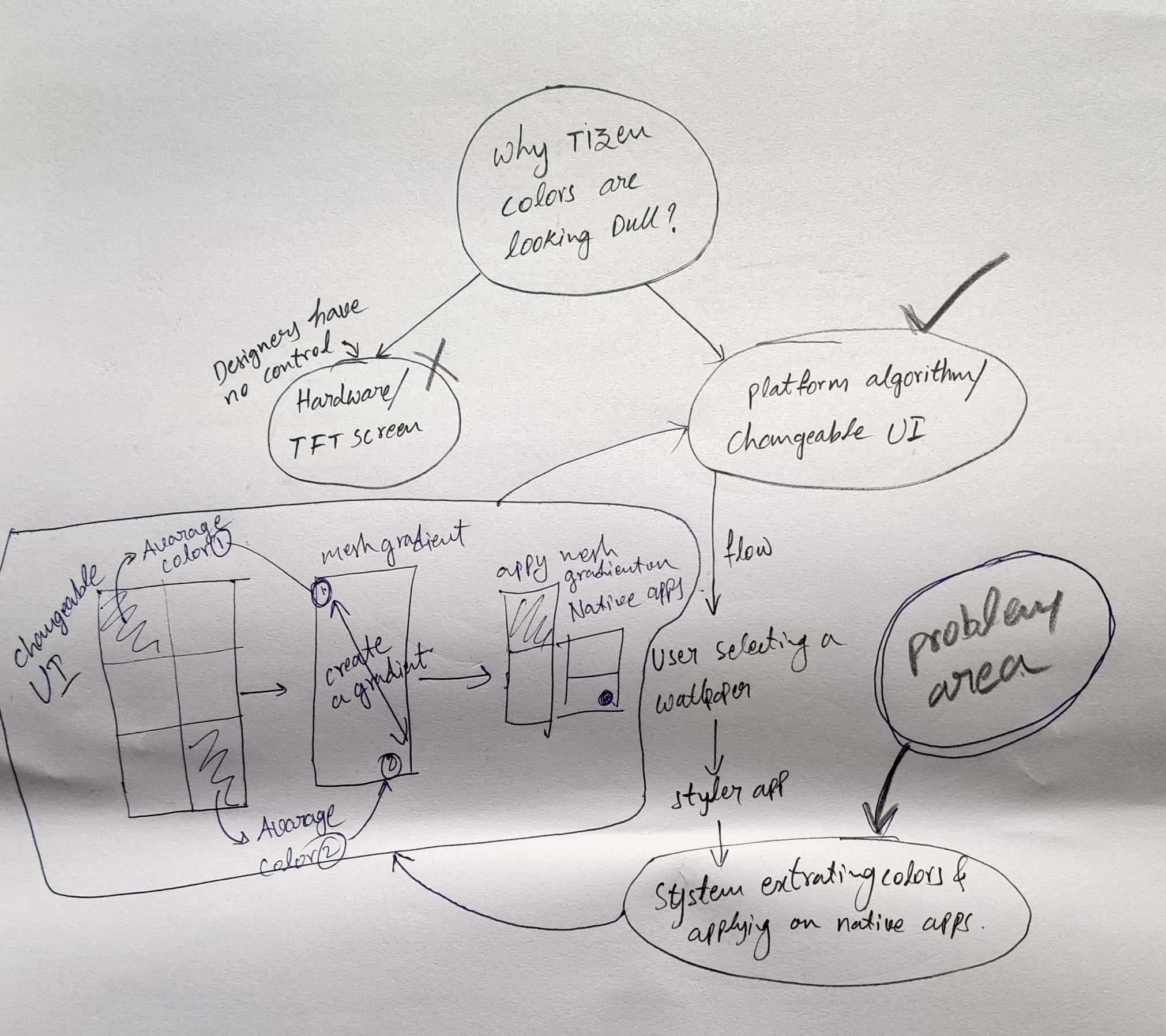
Product move: Reframed dull color UX issue into algorithm redesign for TFT constraints.
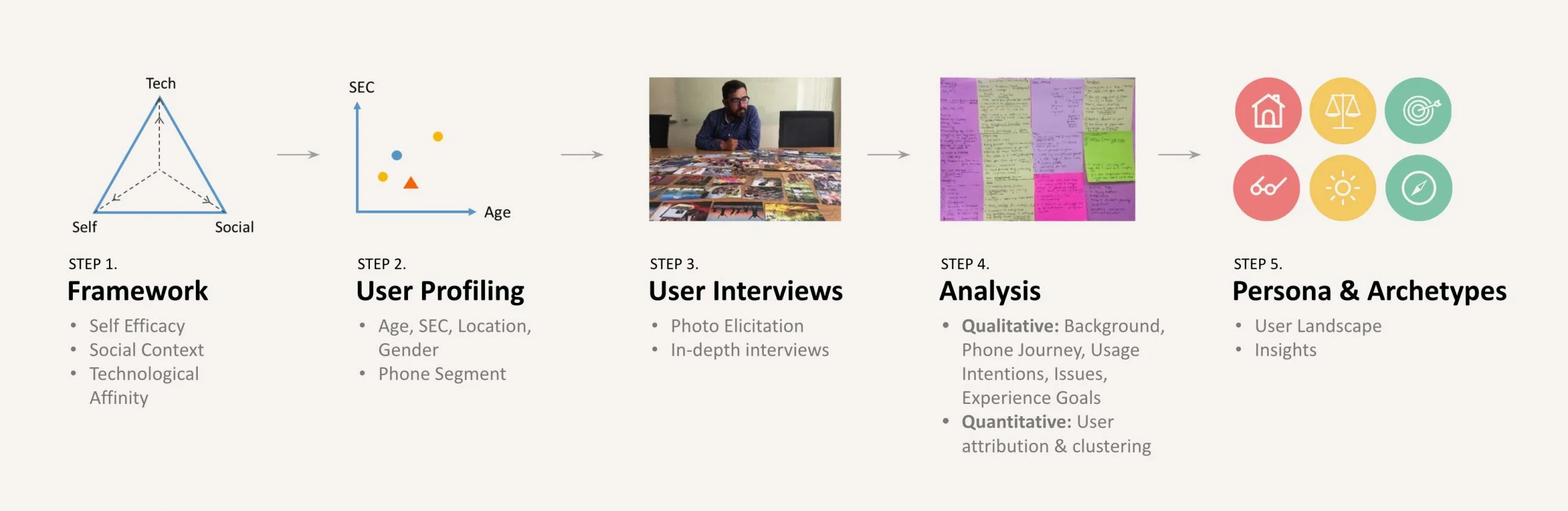
My Contribution vs TeamI owned discovery synthesis, UX framing, algorithm-direction design rationale, and cross-functional decision alignment; engineering and platform teams executed integration and release hardening.
The core insight was consistent across interviews: visual quality degradation was interpreted as product quality degradation. That shifted the team from UI polish discussions to algorithm behavior diagnosis.
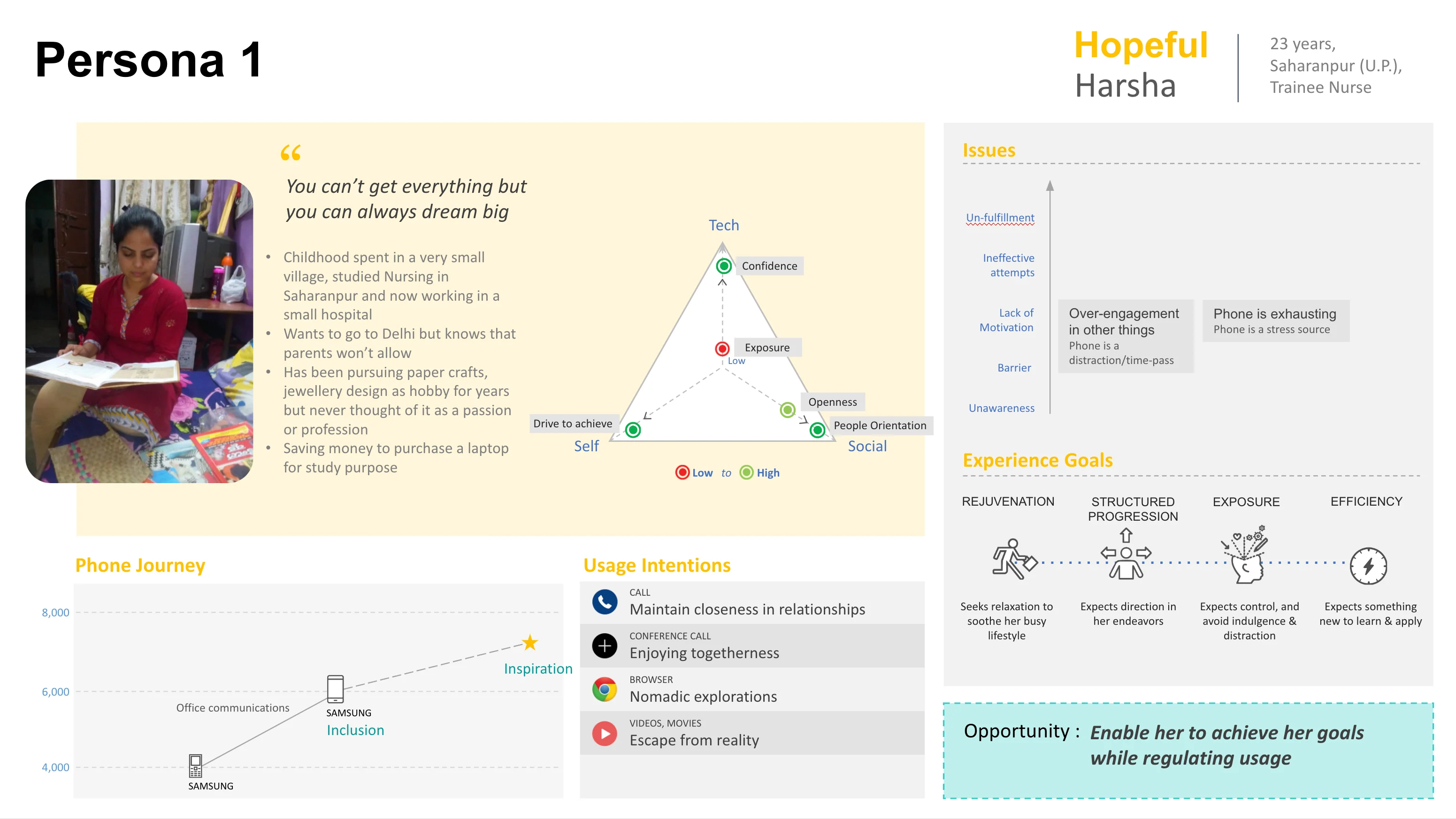
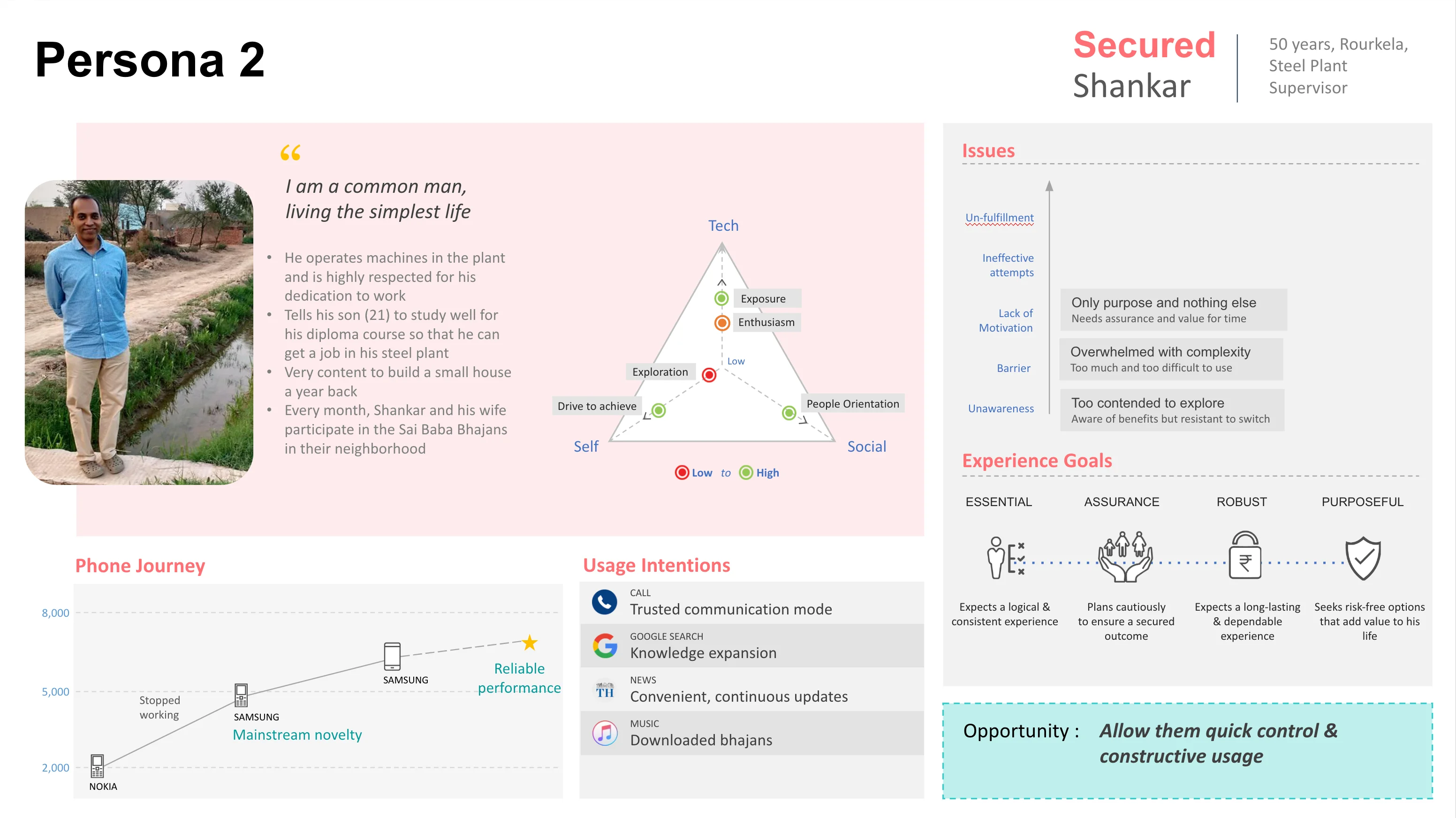
Feature-phone migrants, less-literate users, and aspiration-driven users seeking flagship-like quality.
Where perceived visual quality breaks between wallpaper selection, extraction, and native app rendering.
Treat color quality as a system problem, not a surface-level UI styling problem.
“Users perceived Tizen personalization as visually dull and effort-heavy.”
Design choice: unify “dull colors” and “complex theme changes” into one addressable system problem tied to extraction and rendering behavior.
Aspires to premium experiences and uses visual polish as a quality signal. Opportunity: enable progression while regulating complexity.

Values dependable, low-complexity interactions and practical control. Opportunity: reduce effort while preserving trust.
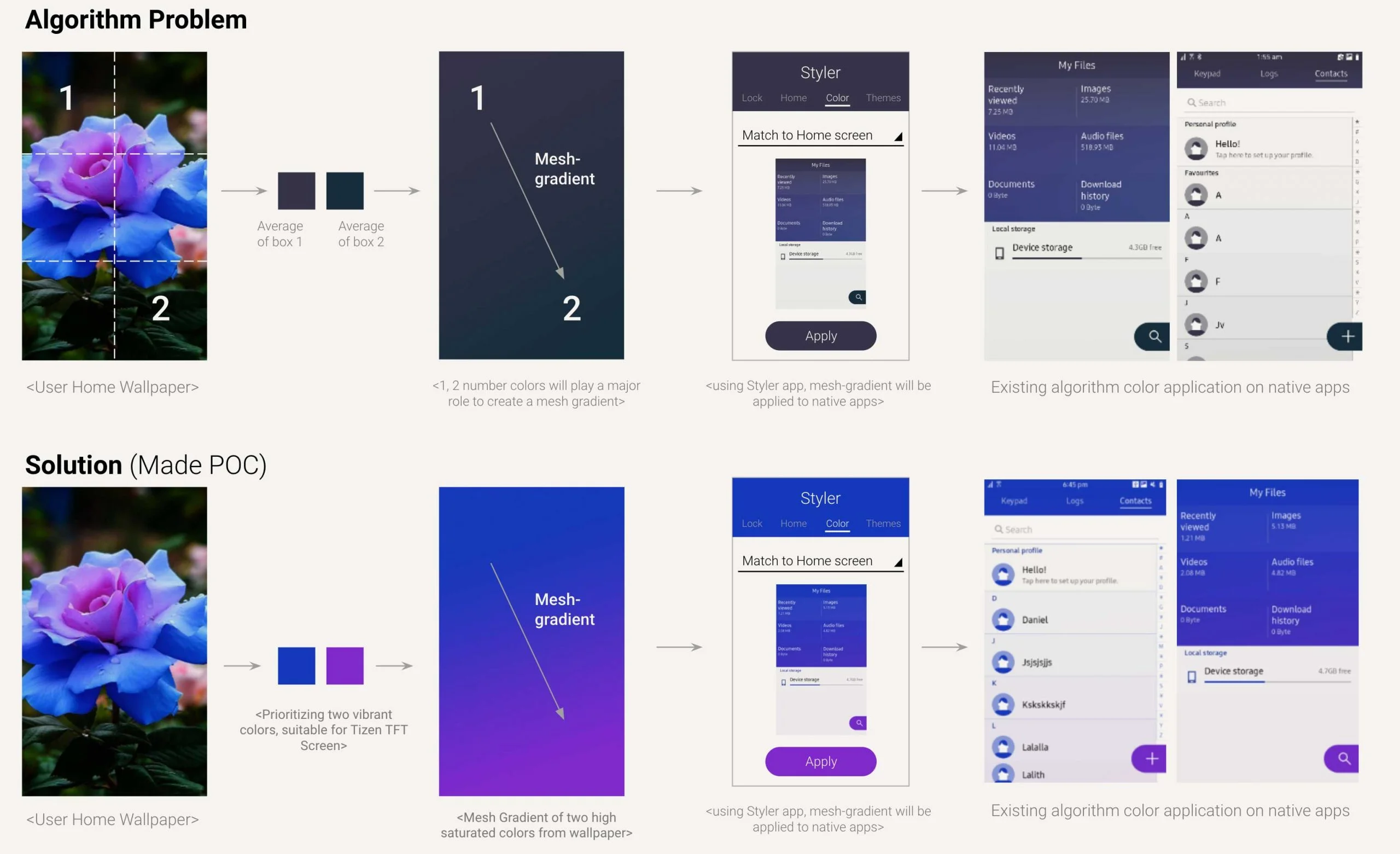
TFT screens reduced depth and shifted saturation, producing dull gradients.
Wallpaper personalization had to remain expressive and legible across app surfaces.
Samsung language needed premium emotional tone even on constrained display stacks.
Full evidence artifacts are preserved here for deep review without overloading primary narrative flow.
Ex: User Wallpaper

Existing algorithm output
Redesigned algorithm output
Redesigned extraction and mesh-gradient logic adjusted hue, luminance, and contrast compensation to maintain personalization intent on TFT panels.
Redesign shipped as part of Z4 themes and wallpapers with cross-functional acceptance from product, PM, and marketing stakeholders.
Tested across portraits, landscapes, religious images, and abstracts. Review sessions showed consistent directional preference for redesigned themes.
| Area | Baseline | Redesign |
|---|---|---|
| Perceived color quality | Frequently reported as dull or washed | Brighter and closer to intended wallpaper tone (qualitative uplift) |
| Readability on native surfaces | Lower contrast confidence across app bars/cards | Improved hierarchy and legibility in themed native screens |
| Personalization ease | Theme changes felt complex and high effort | Faster, lower-friction adaptation from wallpaper to UI theme |
| Preference signal | Mixed sentiment on visual consistency | Directional user preference toward redesigned output in usability checks |
Frequently reported as dull or washed
Brighter and closer to intended wallpaper tone (qualitative uplift)
Lower contrast confidence across app bars/cards
Improved hierarchy and legibility in themed native screens
Theme changes felt complex and high effort
Faster, lower-friction adaptation from wallpaper to UI theme
Mixed sentiment on visual consistency
Directional user preference toward redesigned output in usability checks
Outcome: shipped with Samsung Z4 themes and wallpapers. Qualitative review sessions showed directional preference for the redesigned output across portraits, landscapes, religious images, and abstract wallpapers.
When visual quality issues originate from system behavior, cosmetic UI fixes fail at scale. Durable UX quality came from aligning research evidence, algorithm logic, and brand intent in one decision path.
This shaped later work by making “system-level root-cause framing” a default pattern for high-constraint, high-scale product decisions.